Yes I am a graphic designer and here's how to use the color of the year!
It’s Pantone color of the year time! And for a graphic designer this is the most exciting time of the year. I like to do a video to celebrate the new color every year, so I’ll link that below.
In the video, I share a little bit about the color of the year, and how you can be on trend and incorporate the hottest color into your home decor…without going overboard.
// about pantone
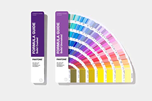
So, what is Pantone anyway? Pantone is the universal language of color that allows brands to keep their colors consistent. Instead of telling a manufacturer you want a “kinda rosy pink with a hint of purple”, you can pull out your handy swatch book and just give them a specific number.
I think there’s something like 2,000 colors in this standardized number system. Imagine all the adjectives you’d have to use to accurately describe all those colors. Thank you Pantone for simplifying things for us designers and helping keep brands consistent everywhere.
// pantone color of the year
Ok, now you know what Pantone is all about, so what’s with this whole color of the year thing and what’s this years color and why?
Experts at the Pantone Color Institute (yes, they have a whole '“institute”) do a deep dive in to what trends will be popular in the upcoming year. They look at color influences in the entertainment industry, they look at films in production, art collections and new artists along with fashion, design and even socio economic conditions. Through these trend forecasts and some color psychology, we’re able to leverage the power and emotion of color through design.
This year’s color is Pantone 17-3938 Very Peri, which Pantone describes as a spritely, joyous color which opens us up to a new vision as we re-write our lives. Rekindling gratitude for some of the qualities that blue represents complemented by a new perspective that resonates today, Very Peri places the future ahead in a new light.
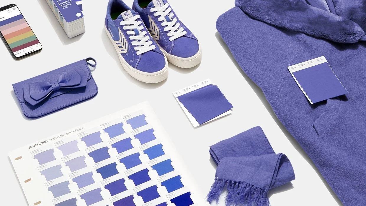
I love this description of this periwinkle color. We are living in transformative times and as we emerge from this period of isolation, our standards are changing, and our physical and digital lives have merged in new ways.
Blue has always been known as a strong grounded color, but I love how this shade of blue is more fun, more energetic and really does have that feeling of moving forward in a positive way. But let me know your thoughts in the comments section on this years chosen color.
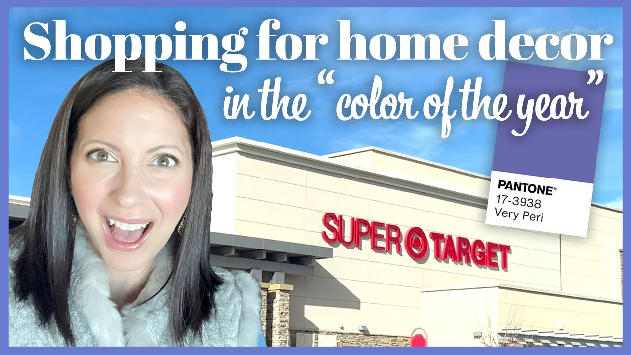
You already know I love design and home decor. And we’re right at the beginning of 2022, so I’m kinda curious if home decor is already reflecting the periwinkle trend. In the video below, I bring you along on a little shopping trip and we’ll see what we can find in home decor that is this shade of periwinkle.
click here to watch the video
// ways to decorate with very peri
Here’s what I came away with from my shopping trip on what you could pick up to incorporate periwinkle into your home, without spending too much money.
Accent chairs
Home Goods had some gorgeous velour chairs in periwinkle. An accent chair would be a great addition to a living room or home office to just add a bit of periwinkle without getting too crazy and re-doing your whole house. I couldn’t find the exact one from Home Goods, but here is something similar, in a slightly darker shade.

Throw Blankets
There were so many pretty blankets with periwinkle incorporated in them. This subtle touch of a blanket on a couch can add the trending color to you home without going overboard.

Throw pillows
Throw blankets made me think of throw pillows, and I saw plenty of options with some periwinkle touches in them. You could go a shade darker and this is a subtle hint at the color of the year, without getting too bright or feminine in your home decor.

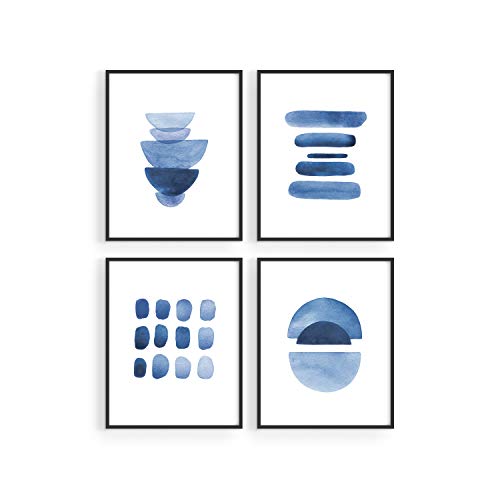
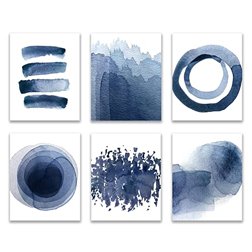
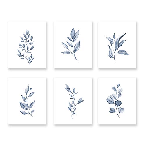
paintings
You could go abstract and use a whole painting in shades of periwinkle, or just pick something up that has a periwinkle sky in a landscape painting, or just a few accents. This is much cheaper (and easier) than painting a whole accent wall periwinkle, although that would look cool too!
storage bins
Bins are a really great low cost way to change up the look of your shelves and add some periwinkle color and pattern into your home. Along with the ideas below, I saw a lot of options in different patterns at Target with the color of the year.


// let’s get shopping
I may have been a little early on the periwinkle trend because I also checked out Kirkland’s, but they still had all their Christmas stuff out. I think this periwinkle thing will evolve as we get a little further into the year and stores are updating their shelves with the new stuff.
Something about periwinkle reminds me of winter, I think it’s the perfect transition color after you’ve taken down Christmas decorations. If you’re looking for periwinkle Winter DIYs, I’ll link a video I did with some Winter crafts that incorporate periwinkle.


FTC: Not Sponsored. All opinions are always 100% honest and my own. Some links may be affiliate links. If you click a link and buy something, I receive a small commission for the sale. It doesn’t cost you anything extra and you are free to use the link or not as you choose. If you do use my links, I appreciate your support.
How about some Target Dollar Spot crafts and Dollar Tree coastal transformations. We’ll be putting together tiered tray miniatures to decorate our little coastal vignette.